


Ask AI About Brandemic

Built From Its Origins
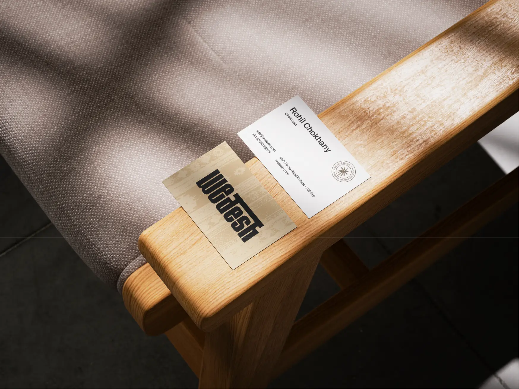
Wedesh was built as a sneaker brand that carries Indian craft forward without holding it in place. Handwoven textiles are reworked through contemporary design, allowing material and construction to lead. Every pair is made with restraint and purpose, focusing on use rather than display. Wedesh speaks to those who value where things come from and how they move ahead; footwear shaped by process, meant to be worn, lived in, and evolved over time.


Positioning an Indian craft-led sneaker brand for a global audience without reducing it to nostalgia or souvenir thinking.
Translating handwoven textiles into a modern sneaker language that feels current, wearable, and design-forward.
Creating a visual identity that stands apart in a saturated sneaker market while staying rooted in origin.
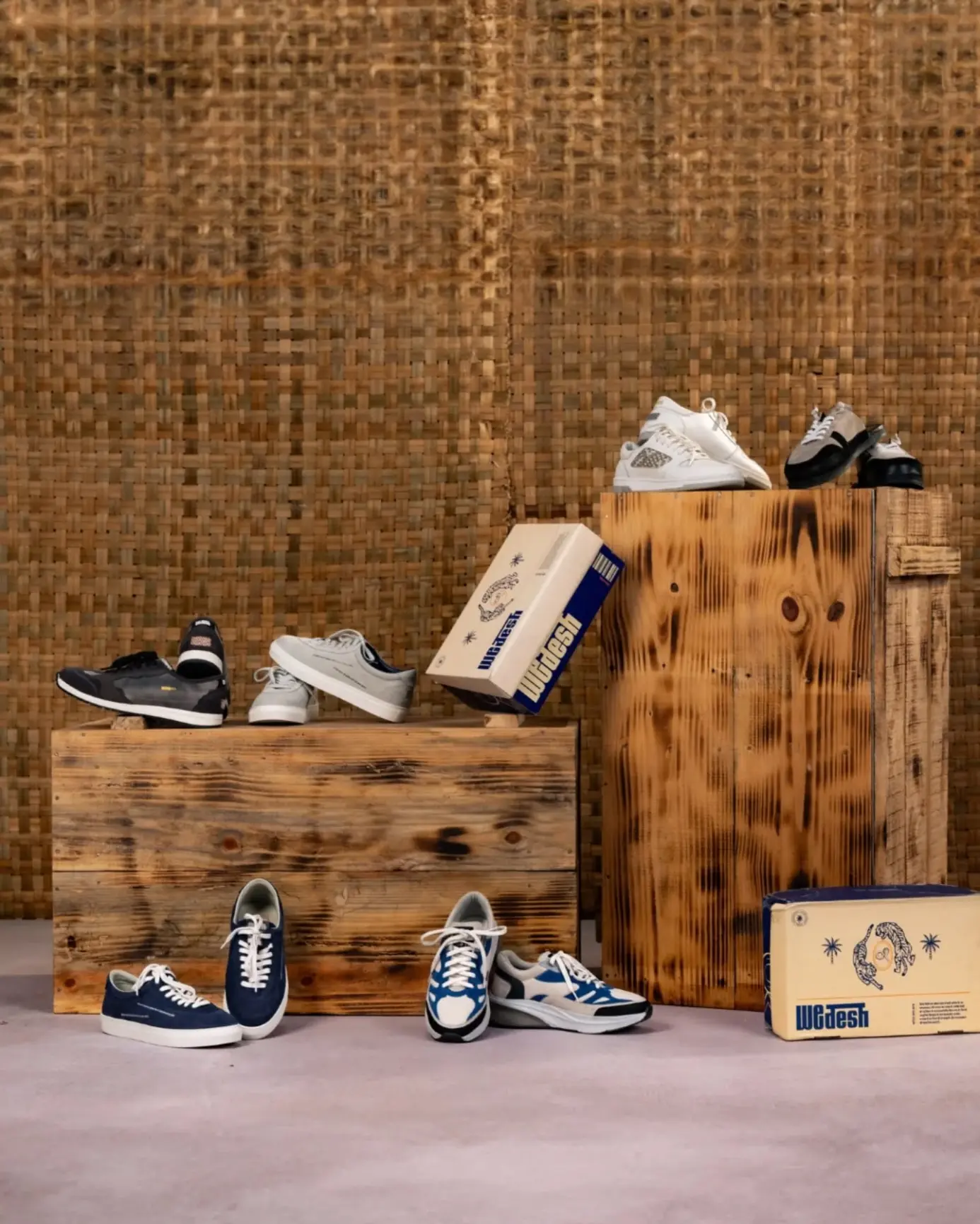
Balancing storytelling with commerce across packaging, digital experience, and photography, so meaning never slowed momentum.
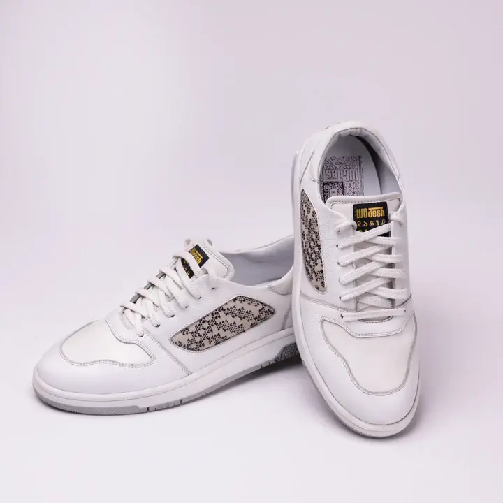


We treated Wedesh as a design-led movement, with a clear point of view, allowing craft to lead without overpowering design. The brand was shaped to honour handwoven work without freezing it in time, translating material, rhythm, and process into a contemporary sneaker language. Visual systems were kept sharp and minimal, letting textures carry meaning. Packaging, photography, and the digital experience worked together to connect story and commerce, allowing heritage to move forward, step by step.


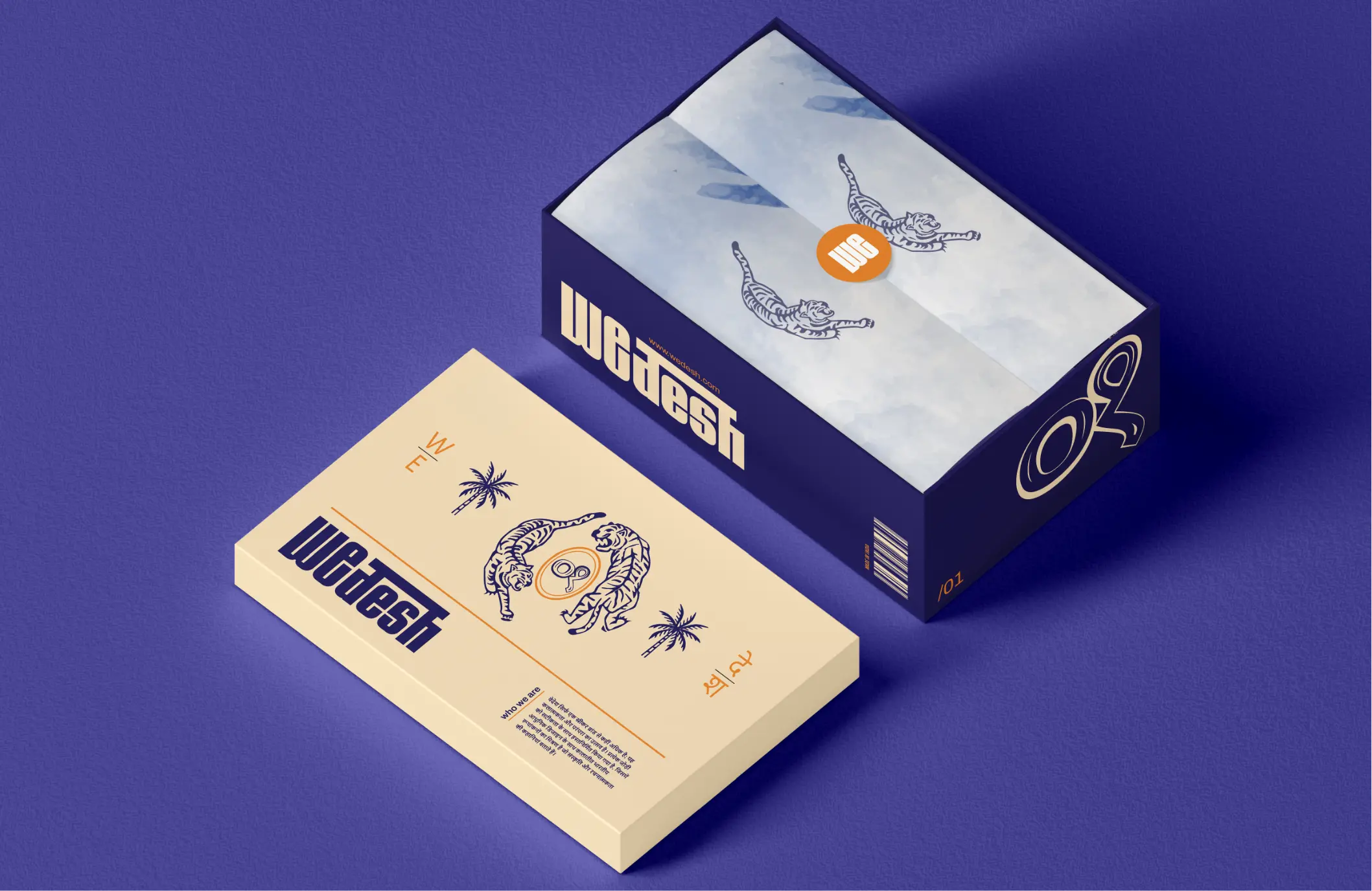
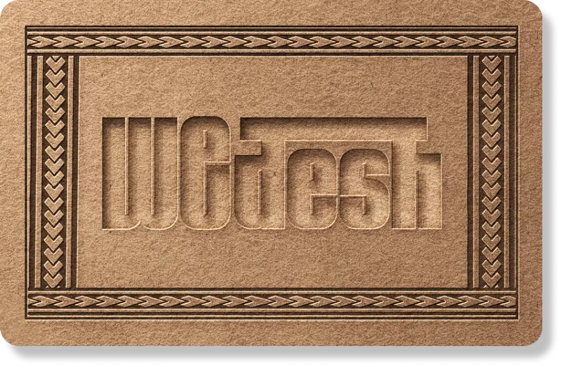
Wedesh’s identity was built to feel deliberate and unmistakable in a crowded sneaker space. The logotype was kept minimal yet assertive, allowing form and weight to lead. A subtle horizontal connection between the “d” and “h” draws from Indic script logic, embedding origin into the mark without ornamentation. A material-led colour palette of muted neutrals and deep blues keeps focus on texture and construction. Graphic elements reference systems of making; handloom markings, archival stamps, and material codes, creating a visual language that feels grounded, contemporary, and built to hold its place across footwear, packaging, and digital surfaces.


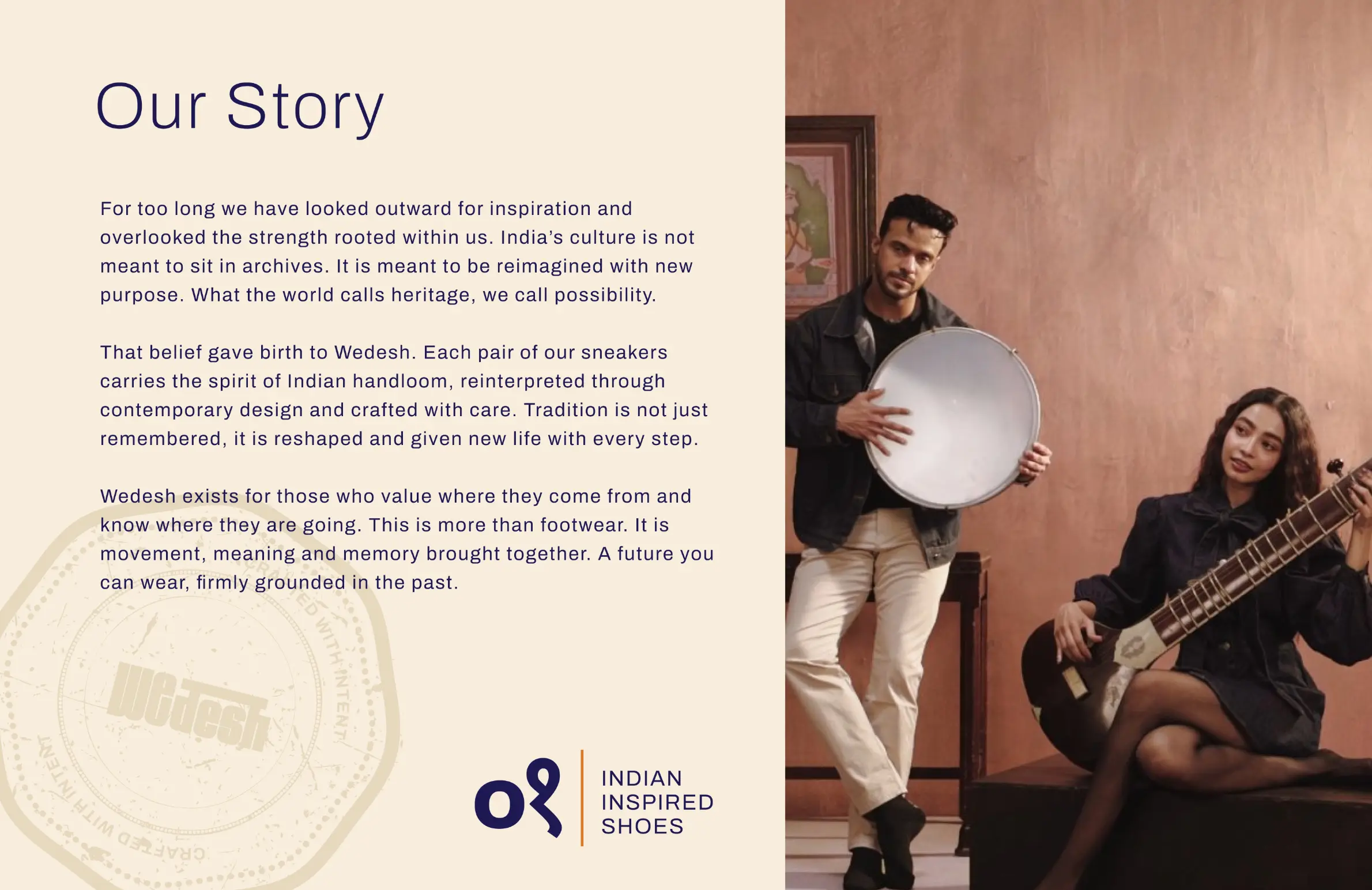
The work gave Wedesh a system that could operate beyond geography. Indian making was translated into form, material, and repeatable visual systems that could function across global sneaker contexts. References to handwoven processes, material provenance, and production cues were embedded into the brand’s structure. This allowed Wedesh to move Indian craft out of a local frame and into a contemporary, international conversation, scaled for production, designed for wear, and built to remain intact as the brand grows.